Good question, and I agree:
information graphics should be removed.
Data visualisation: data based. There are clear numbers involved. Usually stuff like charts, graphs, timelines, networks, maps.
Information design: could be any visual containing some information – it does not have to be based on data(points). Could be informational cartoons, icons, IKEA instructions, signage, isotypes, as well as charts, graphs, maps etc. And the process of making.
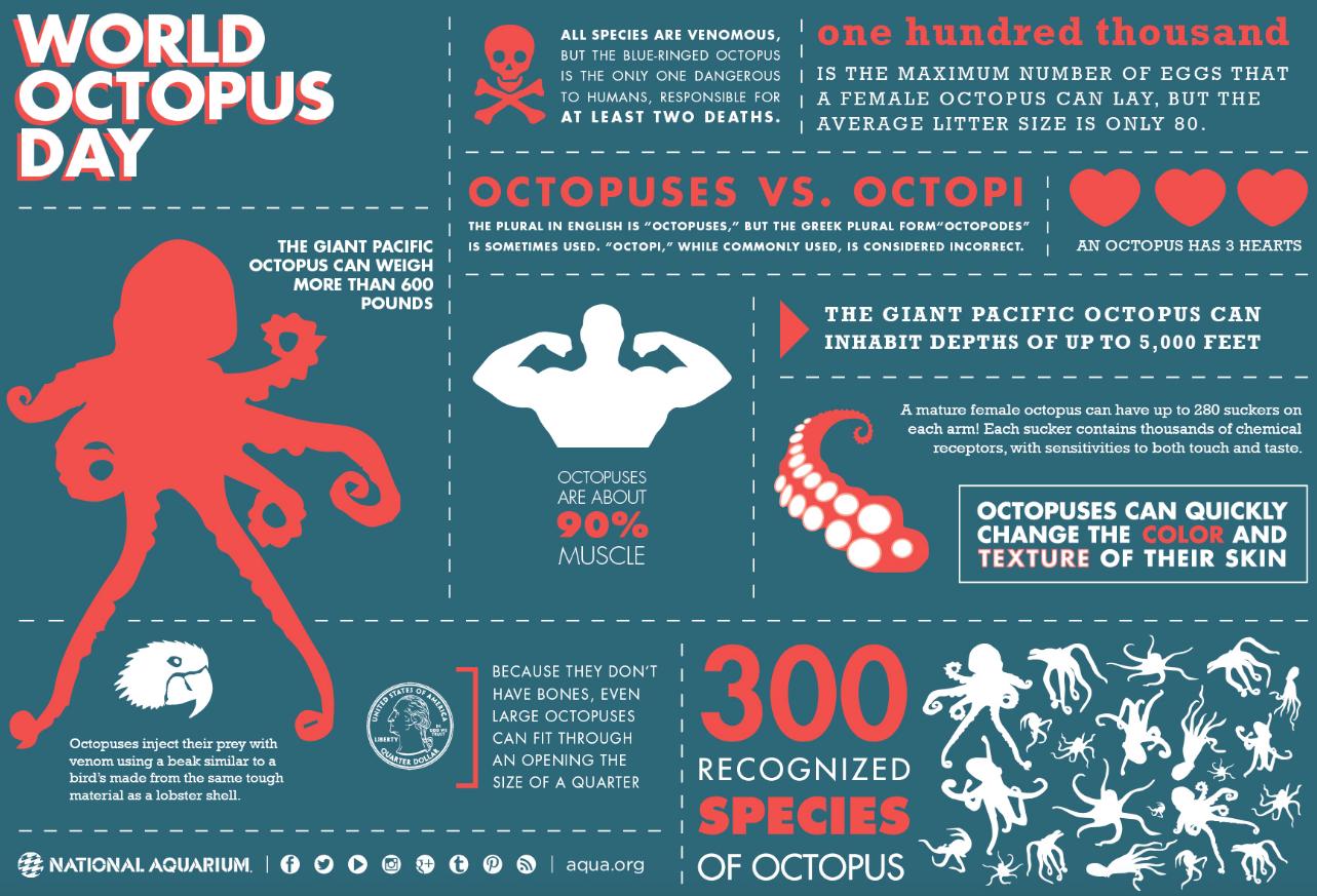
The problem as i see it, is that information graphics often equals "infographic" by which is usually – but not always – meant a poster-like image, often with more illustrations-like elements/decoration. This to make what might be "boring" data visually more interesting.

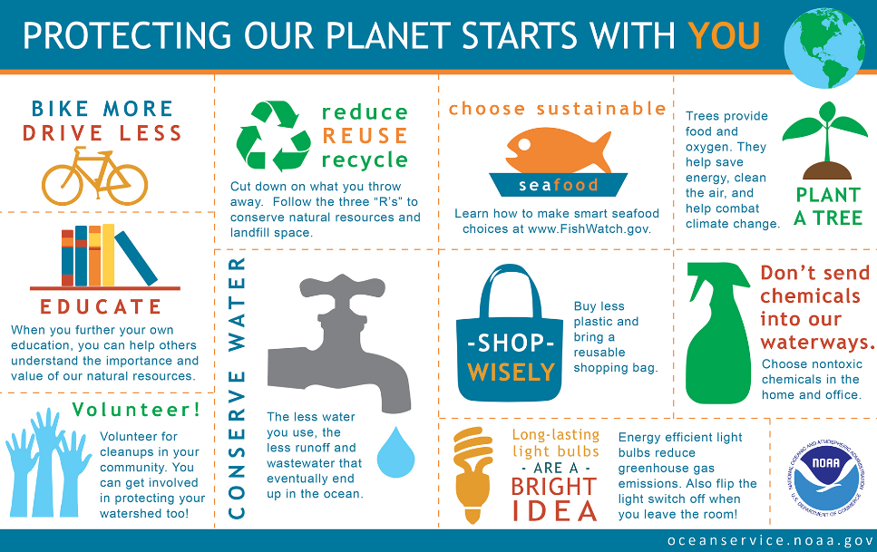
Sometimes, "infographics" contain no data or hardly even any information at all, such as this (which is mainly opinion and vague advice):

The way I see it, information graphics and infographics are not the same thing. Infographics are more to the masses, as an entertaining, low-level, eye-candy way of giving some non-essential information. Information design, is a large umbrella that includes this, but also almost everything else.
This is a very roundabout way of saying I agree that we could remove "information graphics", as it is only suited to confuse, or at best: adds nothing.


