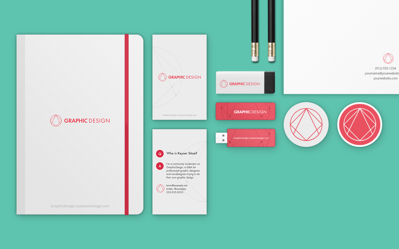
I’m Stéphane, senior product designer at Stack Exchange. First, I wanted to congratulate you because this site is now starting the process of moving out of beta to become a fully-gradutated site! Well done!
Graduation and Your Site Design
Graduation comes with a few perks. I have already begun work on your site's design, which will give you your own unique theme that reflects your topic and culture. This will help brand your site as unique, even while you share common elements with other sites that show you are part of a bigger Stack Exchange family.
Once the design goes up, you will receive a link in the footer of other sites in the network, along with the ability to migrate content to and from other sites — and the notoriety of a public launch that says, "Congratulations, you finally made it!"
Design Concept
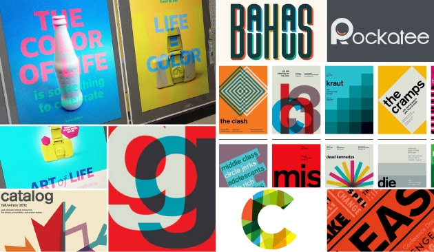
I'd like to share my design thought process with you. Designing for a site frequented by designers is rather challenging. Graphic Design as a profession has a rich history and has produced countless art styles over the years. My goal is to give this great community a timeless branding design, so it not only looks great right now, but also years down the road. When I think of timeless design styles, I gravitate towards Swiss/Bauhaus designs' simplicity and elegance.
Swiss/Bauhaus mood board
I decided to work around 3 basic shapes: triangle, square and circle. Simply because all shapes in graphic design come from basic geometric figures.
You can break down every logo, icons or graphic design to basic shapes.
I wanted the logo to convey the idea of the early creation of a logo/icon, a sketch mood where the construction lines are still visible.
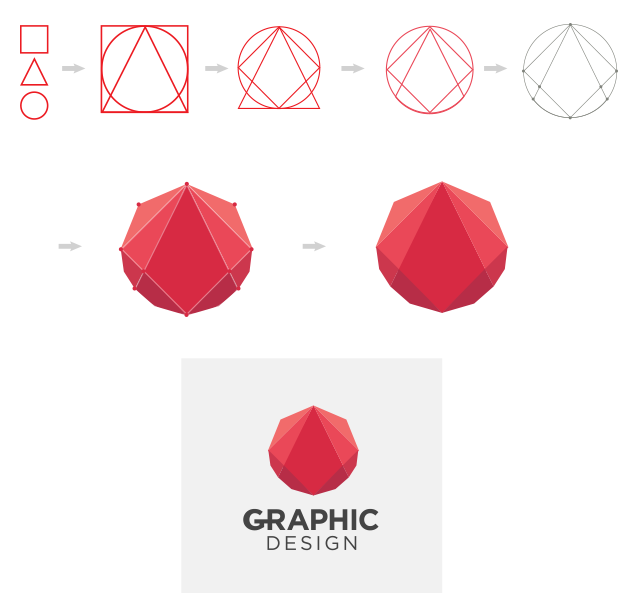
I used red because it's a powerful color which was the most used in the bauhaus/swiss style and after several different color tryouts, red was the most effective.
Does this color represent graphic design? Everyone will have a different answer to this question. But keep in mind that we're not trying to find "the" color for the graphic design, but one color for "our" version of graphic design.
Regarding all the others graphic elements, I wanted something very minimalist and clean, this design has stand the test of time.
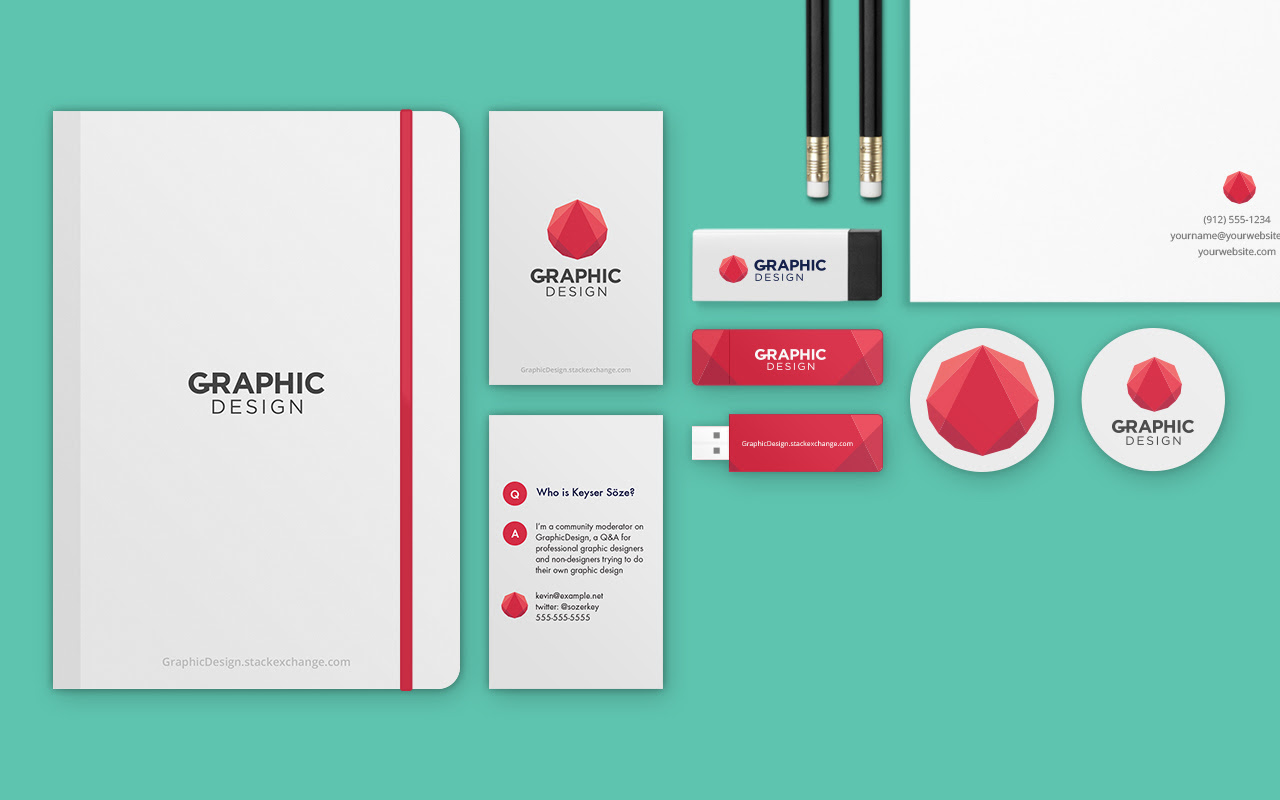
Swag
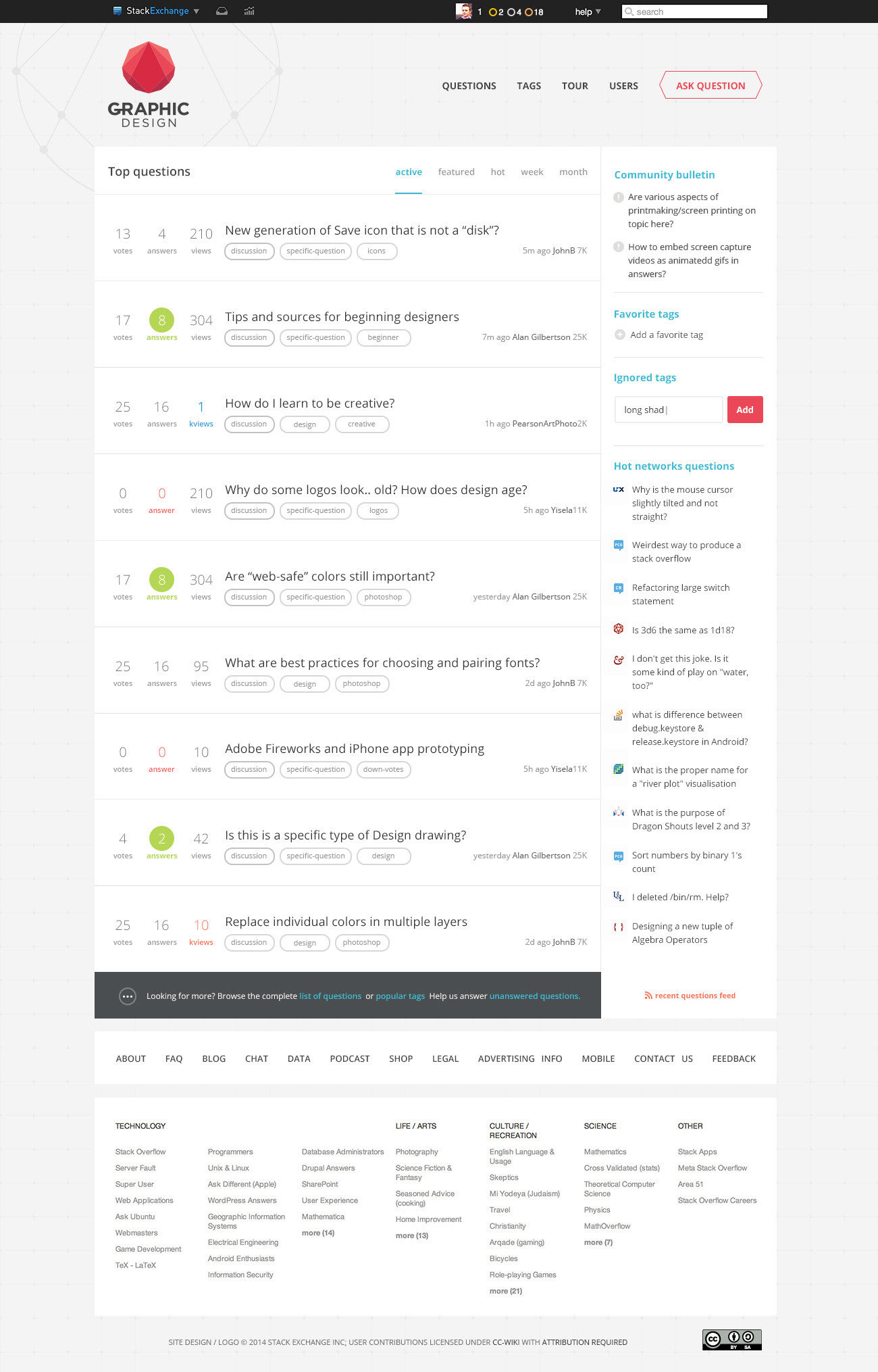
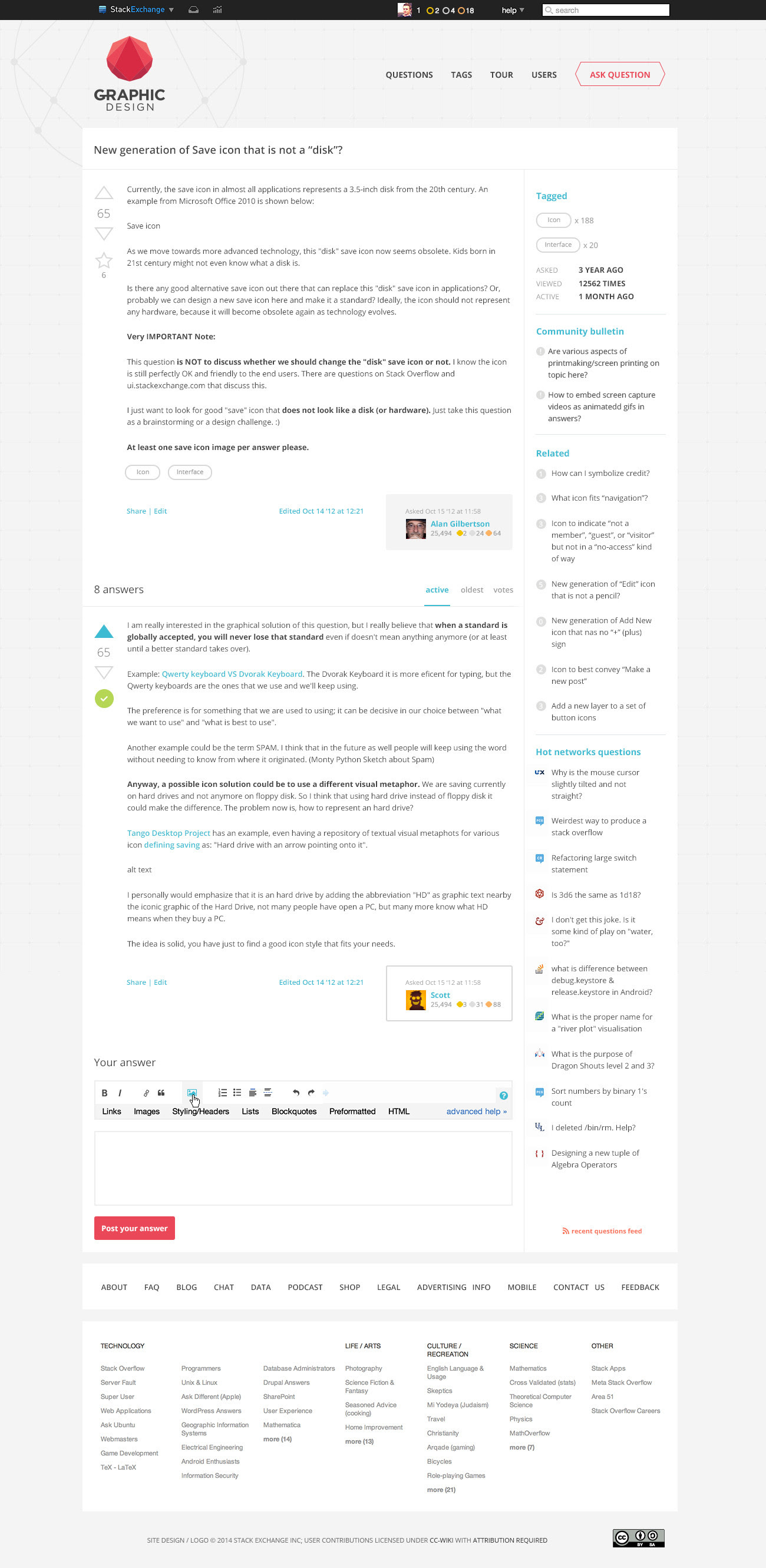
Overall Site Design
please click to see full resolution versions
I believe the design captures the mood I was going for. I'd love to hear your feedback. If there are no major design changes, we're hoping to launch the site soon. Thank you for being an awesome community!
EDIT:
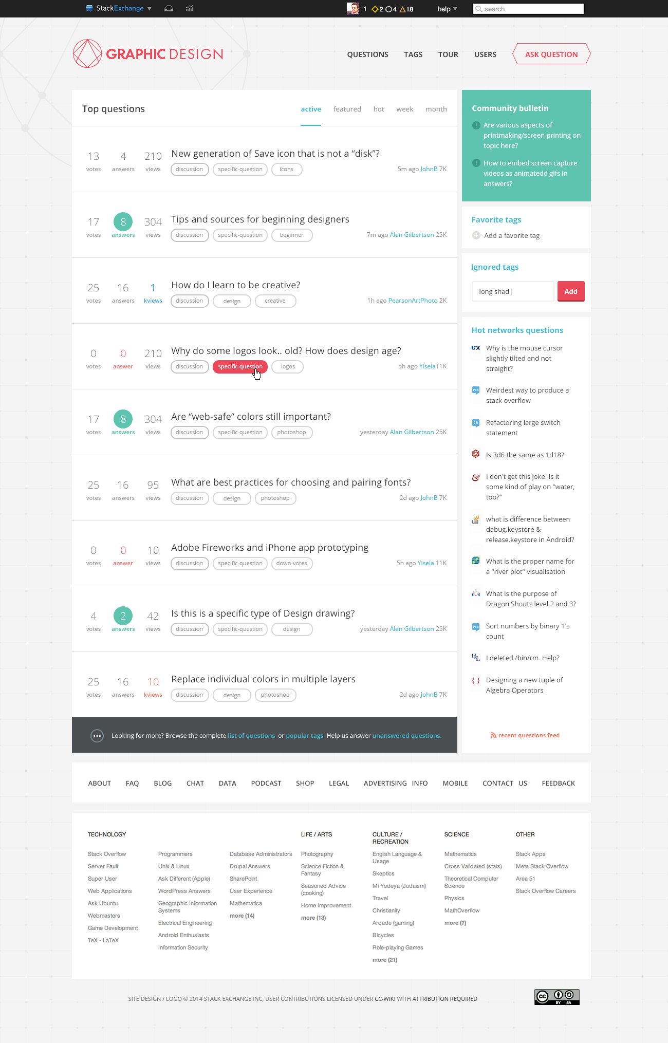
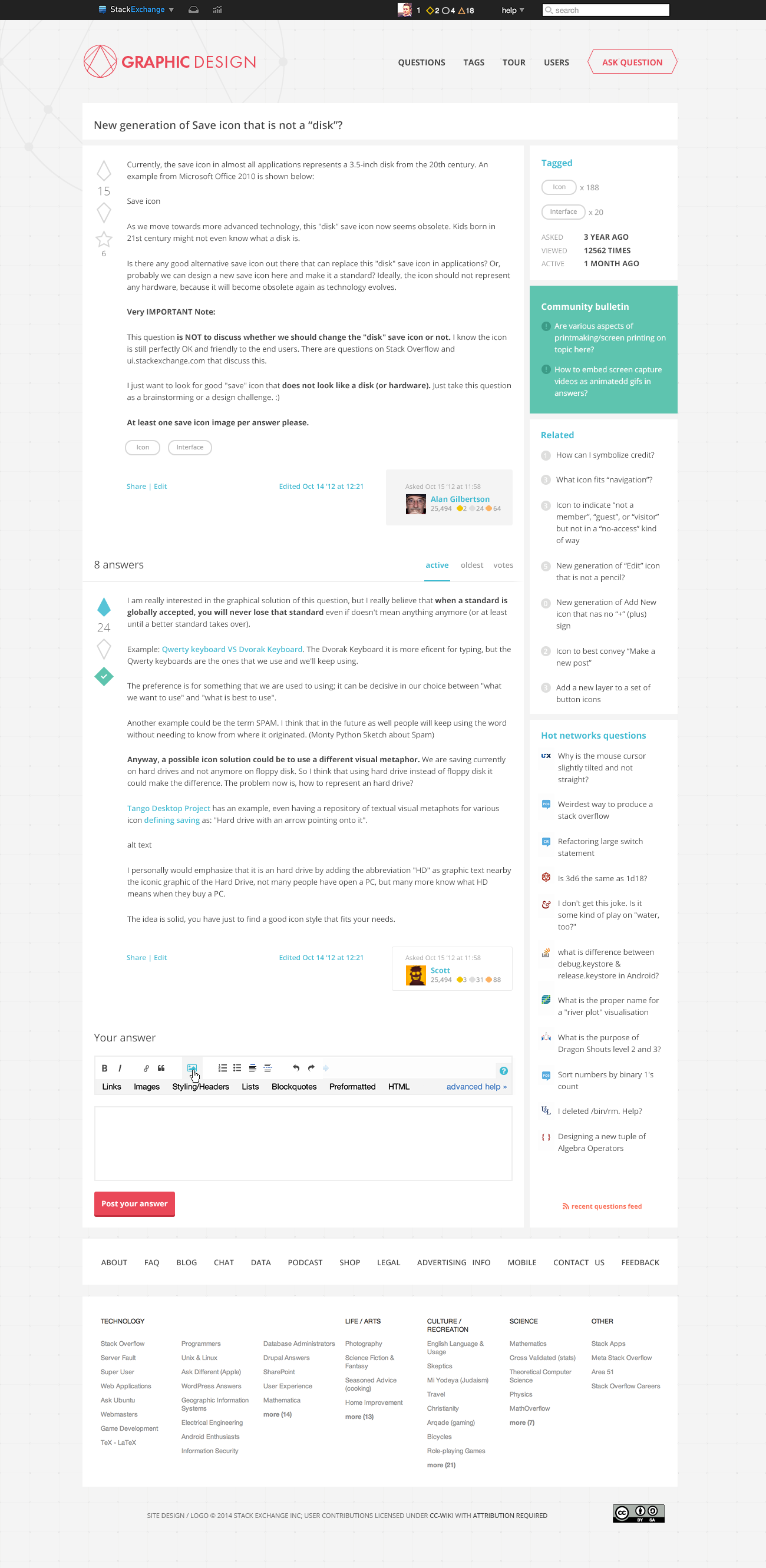
Thank you for your valued feedback! I've made some changes to the initial design based on your answers and comments.
Here is a brief list of the changes:
LOGO
- I removed the connection between the G and the R
- I replace the icon by one I made before
- I put the icon on the left of the type
- I decided to keep a red logo on a light grey background
OVERALL DESIGN
- I added some colors (especially green & some blue)
- I changed some icons (vote, accepted answer)
- I updated the design of the answeree box
- I redesigned the badges, now every badge is a portion of the logo
- I changed the sidebar design
I feel the updated design is more cohesive as a whole, and the logo is unique on its own. I’ll start coding the site today and I hope we can launch the site soon!

